About
Client: Nadal Investigative Services and K&T Protective Services
Category: Security and Investigations
Projects: Logo & Brand Identity, Copywriting, Print Marketing Campaign, Graphic Design, Website
Nadal Investigative Services and K&T Protective Services sought a complete branding and marketing package following a newly formed partnership.
The Challenge
NIS and K&T Protective approached Nexa about creating new branding that would reflect the companies’ relationship while maintaining each one’s distinct individual identity. The design needed to feel integrated and complementary but not “matchy.”
Process
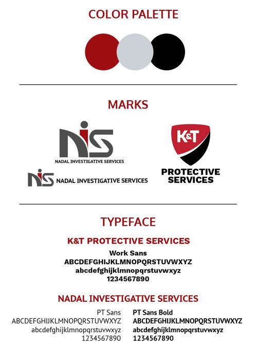
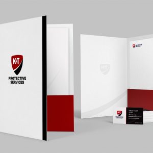
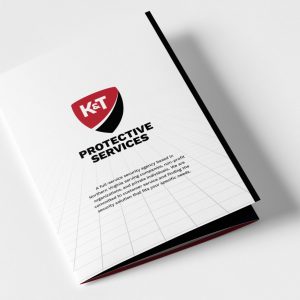
In the investigations and security industry, conveying a sense of strength, trust, and discretion is critical. Red and black were chosen as the dominant colors in the palette. Deep red and black convey strength and power as well as privacy and professionalism; gray serves as a subtle accent color, balancing out the bold primary palette.
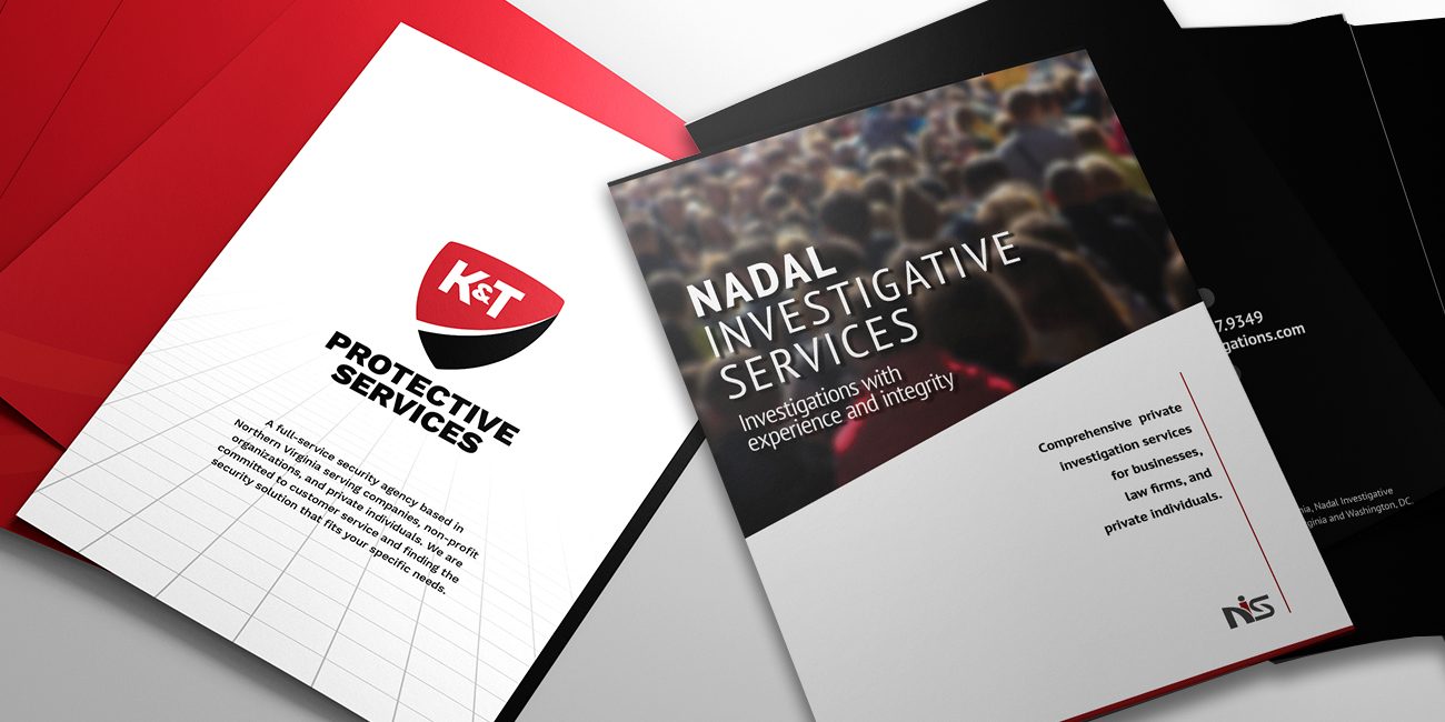
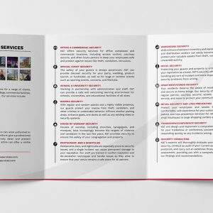
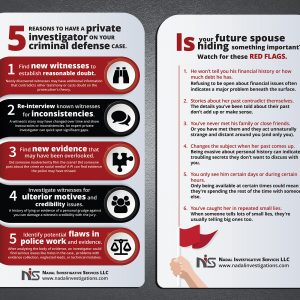
The business cards and brochures were designed with complementary aspects in mind: the same color palette, similar shapes and lines, even the same finish on the cards to create the same physical feel. At the same time, the look of each is distinct and separate, indicating a different company with a different skill set. Typefaces are both closely related sans serif fonts, evoking streamlined professionalism yet retaining individual identities.
- Logo & branding
- Business cards
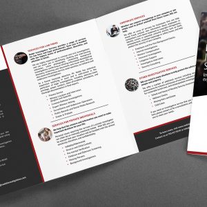
- Brochures
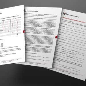
- Promotional materials, including pens and shirts
- Websites & social media
Result
Both clients were highly pleased with the final result, stating that it perfectly captured the high-end, professional feel they were going for and that each company’s identity felt individual but also complementary.

